Thursday, November 6, 2008

Ainu Museums (Steve Lang)


While traveling around Hokkaido, the northern most island of Japan, I visited two Ainu Museums. One was in Biratori called the Nibutani Museum and the other was in Shiraoi called The Ainu Museum. Both of these towns were visited by Hiram Hiller in 1901 where he collected many of the objects that now compromise our Ainu collection. It was quite a treat to see many other examples of artifacts in our collection. The exhibits gave the pieces context and provided insight into how they were put to use and created from the surrounding wildlife and plant life of the region.


The first museum was the Nibutani museum in Biratori, it had a small gallery packed with artifacts.


One case had much of the plant life that was turned into meals for the Ainu. Above is a photo of some lily root cakes and the starch that was mixed to make them. Hiller collected two cakes and brought them back to the Penn Museum.


A mock up of the weaving equipment used to make the Ainu robes.


They had a beautiful wooden cabinet that housed many of the Ainu robes. The cabinet had drawers that could be pulled out so you could see the front and back of the robes.

The second museum I went to was the Ainu Museum which was located in the Poroto Kotan a small Ainu village. They had traditional dances and music demonstrations every half hour and allowed you to watch weavers and wood carvers make various artifacts.


Dioramas, models, photos,video and paintings supplemented the objects in the displays.


An Ainu woman plays the mukkuri or jaw harp as part of a demonstration of Ainu music.

The Hiller collection has a child's hoop toy very similar to the ones seen here.

We also have a number of beaded necklaces similar to those seen above. I was particularly interested in the necklaces that had tsuba as the metal pendants that hung at the end of the necklace.


Each house had a firepit inside with artifacts hanging on the wall where they would be traditionally used as part of the household activities. For a small fee you could wear a robe and get your photo taken.


Ainu men and woman perform a ritual dance while tourists and school children watch with cameras and notebooks in hand.


The video of the weaving process from harvesting materials to finished robe was also very instructive.

Monday, August 11, 2008

Ethnologisches Museum, Berlin - Oceania (Lynn Grant)


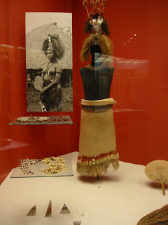
Same trip, different city. And to be absolutely clear, the Museum is on the outskirts of Berlin in Dahlem village, but it's an easy U-Bahn ride. And well worth it. Like the Musee du quai Branly, they exhibit a lot of sensitive ethnographic materials at low light levels but careful use of color in backgrounds made all the difference. I also really liked these zig-zag case designs that made it possible to show a lot of material in a small space, while clearly separating them.

As in our Polynesian gallery, they make effective use of old photographs and prints to bring the object to life. They seem fine with using non-color images.

Unlike in our Polynesian Gallery, they have their large Hawaiian feather cape exhibited fully supported..


My vote for one of the coolest artifacts ever: A Kiribat suit of armor. Pufferfish helmet and corselet, stingray spine gauntlets, shark tooth sword edge, woven coconut fiber mail. Warfare with Style!

And apparently we're not the only museum having trouble storing our large canoes. At least ours aren't (currently) in the galleries, blocking access to the exhibits....


And just when I was going to give them top marks for sensitive and preservation-minded display, I came across this poor fiber bag nailed to the wall. Okay, maybe it wasn't literally nailed to the wall, but almost. And it was certainly suffering.

Musee du quai Branly, Paris (Lynn Grant)


While on a courier trip in June, I had a chance to see this museum, which contains the collections of the now-closed Musée national des Arts d'Afrique et d'Océanie and the ethnographic department of the Musée de l'Homme. The museum opened in 2006 and contains 267,000 objects in its permanent collection, of which 3,500 items from the collection are on display.

The building is pretty interesting, designed by Jean Nouvel, and featuring a "vertical garden" by Patrick Blanc.


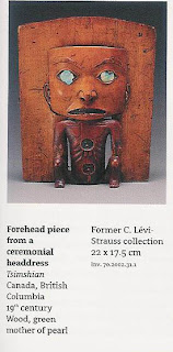
It's also surrounded by a lovely horizontal garden. And the interior starts out interestingly, with a snail- (or Guggenheim-) like ramp spiraling around an open storage area. This quickly deteriorates into a long, uphill slog, with little visual interest and way too many speeding children plunging down the straightaways. Once I finally reached the exhibit areas, I found them frustrating. The lighting levels are low, as appropriate for an ethnographic collection, but the dark walls and floors make it hard to see the artifacts clearly, even when all the lights are working, which was often not the case. (In the special exhibit on Paracas textiles, so many lights were out that it was impossible to see some of the most important artifacts, or many of the labels - I really wanted a flashlight.) All the more frustrating because there were some fantastic artifacts in their collections, including many from Claude Levi-Strauss's personal collection.

The wonderful artifacts were all too often not fully identified (no tribal affiliations for many of the Native American pieces, for instance) or were displayed in strange juxtapositions. For instance, one case included a Sioux warshirt, a Umatilla parfleche, an Acoma pot, a Chancay textile, and a Tiwanako stone block. The theme of the case (I tried guessing, without reading the labels, with no success) was "Duality of the Sexes" making a point about male art being figurative and female art abstract. !?!* It was like a post Grad course in Anthropology. And we think our labels are too hard for our visitors! Did you know that beads and weaving are all metaphors for language? Or that "all containers evoke the idea of vitality, because living bodies are made of blood, flesh, bone, viscera, and a soul". Too ethereal for me - I just like looking at objects, so it was a relief to move on to their Crystal Skull, (labelled clearly as a modern fake but attracting a lot of adolescent attention).

The African collections were also wonderful but similarly hard to see and appreciate. I noticed glass shards in one of the cases, a result of using untempered plate glass vitrines, and having seams where visitors leaning on the glass would cause such damage. I spent several minutes trying to find a gallery attendant and trying to figure out how I could convey the message when I couldn't remember the French word for broken ('il y a quelque pieces du verre dans ce vitrine la'?) but finally gave up and decided to just be a tourist.
Final score Collections: A; Exhibit: C; Upkeep: F
Photography was not permitted but I got a *great* guide to the collections, full of color images, for only 15 Euros. Let me know if you'd like to have a look

Wednesday, May 21, 2008

What I learned at the ACUMG meetings in Boulder (Katy Blanchard)

A lot of people are capitalizing on the Darwin anniversary this year: Northwestern's book of the year is The Reluctant Mr. Darwin.

Listening to the conference, this year entitled: Interdisciplinarity and the Empowerment of the University Museum, I started jotting down ideas that I thought we could bounce around:

-Programming in unusual places
-Can we do a science of conservation show?
-A crosscultural myth show? Students on campus could all read a book, ties into history, different cultural departments, art history, etc.
-We could pick a year, or a century and showcase material from that time in each gallery--a new case per gallery?
-Outdoor film series in the Warden Garden
-Video walk throughs
-Show involving children, easy tie in to the visitors
-With the presidental election, a propaganda show?

Just throwing ideas out in the forum in which we have for now

Saturday, May 17, 2008

Why can't we do that: What I think we can take from the Denver Art Museum (Katy Blanchard)


This year's AAM took us to Denver; and a free afternoon was spent discussing modern art with Maureen. We noticed a lot of interesting things that while might not fit into our own museum, I think the ideas can get transformed for our space.


Their use of large scale photo murals, to me, really helped delineate space. I returned to find that it was done really well in Penn in the
World, and here you see it done to differentiate
the different North American Tribes in one large space.


Here you see a listening station. You can hear a variety of poetry, stories, and songs in several Native American languages;
your choices are outlined on the angled "menu" and you can follow along in the binders.


And my favorite, was a children's interactive program.
Throughout the entire museum were spaces just for children: In the African section, there was nook between case units, and a small video installation with cushion on the floor. In the Oceanian section, you could make your own sculpture. It was simple, yet obviously, I got on the ground to organize some magnets. I call it Untitled (Memorial to a Fallen Prince) But how simple an introduction to a gallery.


Sure, the DAM has enough money to hire Libeskind to create their new wing, but it was the simple points that I think we can try to use in existing galleries, before we ever redo one. Or before we add a giant Oldenburg trowel out front.

Tuesday, May 13, 2008

Five Hours, Five Museums: My afternoon in Houston [or, katy waxes nostalgic about the Menil collection] (Katy Blanchard)

My recent trip to Louisiana gave me a free day to get over to Houston to see LUCY at the Museum of Natural Science. I figured since it was a long drive there, I'd make the most of my afternoon and see as much as I could.

My morning started at the Health Museum (seen at left) which will soon house our own Surviving Exhibit. It has been expanding only over the last year and a half. They have almost doubled their exhibit space as well as grew their incoming program to include a broader science audience, fulfilling both their mission and the void in the city. They also have live theater demonstrations several times a day where they perform science experiences and dissections for the very large volume of student visitors. They recognize that this is their main audience and therefore book more scientific shows into the school year, and the broader [read Star Wars] shows for summers. I must say I was incredibly impressed with their ability to grow. It allows a girl to dream.

I followed this museum with a visit to the Houston Museum of Natural Science to see the Lucy Show. Of course you couldn't take photos of the show, so instead you get their parking garage banner: with the kinda odd dropped-jaw aesthetic.

You had to wind through the museum through the throngs of school children [there are dinosaurs there, too, so i can't blame them] while listening to the overhead speaker system declare which school group should report to the auditorium when. Thank goodness we don't do that. It was incredibly distracting.

I was told that I would be disappointed, but that didn't mean I didn't enter the exhibit with eager eyes. I lucked out that no school groups were inside, so I was practically alone throughout the entire show. However, there was so much sound, I wish there were bodies to absorb it all.

As an optimist, let me give you the good first: The cases are mainly pulled out from the wall, with text on both sides. I have found I enjoy this more and more in exhibits [see my later review of the MFAH Pompeii show]. When cases were against the wall, they were more of a case IN the wall, much like our exhibits department has done with the Penn In The World show, allowing you to see the pieces from both sides. Also, the show gives a broader view of Ethiopia than just Lucy.

But to me, this was the uber-problem. It was a tourist show. There is nothing wrong with wanting to bring people to visit Ethiopia. But Lucy was not in context. You enter the gallery and the first and only thing you see is a cast of her skull and a large detailed wall mural of a time line. [Anyone who has spoken to me about Surviving knows I think ours is the best, go see that if nothing else] The only other objects remotely in her time period [and by that, I mean from BCE] are a few very large stone tools.

You are then dumped into a video about why Ethiopia is so great. This video is so loud you can almost hear it the moment you walk in, so I will admit I was pulled towards it. But not for long. Not that I think Ethiopia isn't great, but I'm not looking for a vacation destination. I'm looking to find out about Lucy. The next galleries are all about religious art of the 19th and 20th centuries, the beginning of the Rastafarian religion, for example. Throughout these two rooms there is an atonal wind instrument and I don't care if you call me a colonialist, it was headache inducing. I couldn't concentrate on another wooden cross and I made my way to the next room where "Lucy in the Sky" could be heard in a hallway before you think you should hear it. A hallway full of text panels about the history of australopithecines. But again, the music was so loud and the text so long, I couldn't read everything. I then wandered into the next room because I hear a video playing. Here, not a single person was identified. Not even Donald Johanson. Now, maybe I don't give the 12 year olds credit. Maybe he's more recognizable in Houston than Michael Jordan. But I only recognized one of their curators, Dirk Van Tuerenhout because he worked with us on Vanishing Worlds. I can assume the man hosting the video was their director. But seriously? No one was identified? I got more information on the annual rainfall of Ethiopia (varies in region from 4 to 80 in) than I did about the actual discovery.

You are indeed then led into a room with her actual skeleton laid out, like our Big Lady, recumbent. In a darkened room, on black velvet? The case was only about a meter high, but I know, kids. I must admit, it was pretty awe-some to see the actual skeleton. It made me even sorrier that I had missed Johanson's lecture.

When I left a man that I spotted in official polo shirt inside the exhibit asked me if I had any questions. I am not sure if everyone gets asked this on their way out, or if it was a slow day, or if it was because I was taking notes, but it was indeed a personal touch. I should have said, "yes. who was in that video?" But I just thanked him for his time.

To further prove this was co-organized by the Ethiopian Department of Tourism, the gift shop included tourist guides to the country. In the same shop were tie-ins to their Da Vinci shows. But no Eye-Witness guides to Florence.

Better than the HMNS? The rose garden that is part of the museum district. In the Texas heat, I was glad to have a shady, beautiful place to walk through. I thought it was a nice touch for the museum district.


Next? Onto the Museum of Fine Arts, Houston. No photo. Sorry. I went to see their temporary exhibit on Pompeii: Tales of an Eruption. I forgot, but I had seen this show in Chicago as well. And I have started to appreciate seeing the same show in different locations. At the Field Museum, it was the same space they had King Tut, and I had many more good things to say about Pompeii than Tut, because of the way they had it laid it out. In Houston? It took up a floor. There were life-size murals of the ruins [of the "waterfront" of Herculaneum, but it was idenfied as such, so not so strange.] The show was spread out so much, that had I been there with more than 20 people, I would have been glad for the space. The show is mainly jewelry and people crowd around cases to look. In Chicago, the casts of the residents of Herculaneum were grouped together, and here, they were spread out so singularly in each room, that I walked around them much as I did the statues--for good and for bad, they were singular objects.

What I really enjoyed was the fact that nothing was in front of the wall paintings, and for the first time I saw all the graffitos on the murals from the House of the Crpytoporticus. And they were worth the price of admission right there. You can't even get that close in Pompeii.

One other thing that I will say for the MFAH is that they have instated the Target Free First Sundays. Thats right, Target is paying for the museum to be open on the first Sunday of the month. Why can't we do this? Our admission is a heck of a lot less, and their building takes up 4 city blocks on two sides of a major street. It must be cheaper for our Target to do this here.... I say we make a move before Target sponsors the Mutter...

I made one last stop in Houston. At the Menil Collection.

I am warning everyone right now that I love Renzo Piano's use of local materials and ability to direct natural light into museum collections. If I had my way? He'd do our Masterplan. But so I can't go to Houston and not go to the museums. First of all, its a free collection. Their main building [seen here] contains collections from Hissar to Pollock. But I enjoy the most is that they have several auxillary buildings of just one person's collection.


They have the Rothko Chapel, where you can actually see his work in context, and not amongst screaming children and cell phones ringing, and heeled shoes pounding.
But the one I must see while there? The Cy Twombly gallery. You can see the lighting system raised above the natural height of the roof.

I could go on and on about my favorite series in their, the monochromatic "untitled" series from 1988 dedicated to Rilke, but this is not an art history article. Its talking about things we like at other museums.

And me? I like the light. I like that several Houston museums are free [like the Menil collections], that some are free on certain days [Target Free First Sundays at the MFAH], that some are growing, [the Health Museum]. But then again, I also like that our shows are going to many of these institutions and our research can be accessed by everyone there that can take advantage of those things that we can't seem to get to: a growing audience.

Monday, April 21, 2008

Two Neat Ideas from UBC Museum of Anthropology (Jim Mathieu)

While attending the recent Society for American Archaeology meetings in Vancouver, I had a chance to visit the University of British Columbia's Museum of Anthropology. Besides being impressed with their extensive collection and display of totem poles, I really liked two elements found in their galleries.


The first were these drawer blocks that housed various artifacts. On top of the block were large catalogs where one could look up the specifics of each of the artifacts on display. It seemed like a really intriguing way to store and display many more artifacts than one might find in a glass case, and at the same time it allowed the visitor a sense of discovery as they opened the drawers to find what was waiting within. Here you can see a room full of these drawer blocks with numerous visitors exploring their contents.


The second element that I found to be really intriguing was the location of their Digitization Studio...right off one of the main galleries...and visible through a glass window. Although we visited on a weekend and therefore didn't get to see any digitization being undertaken, the description printed at the right of the window explained what would be going on during the day during the week. This seemed to solve two problems that any Museum might have: (1) creating a space where digitization work could take place (i.e. carve it right out of your gallery areas) and (2) showing visitors how the Museum actively stewards their collections.


Oh, and if you look closely at the lefthand side of the studio window you can see a third neat feature: an Object of the Day. Here it is close up....


Tuesday, March 25, 2008

Second Bank/Portrait Gallery (Katy Blanchard)


THE SECOND NATIONAL BANK


There is a chance that I enjoy a good strong doric column more than other museum goers. That being said, The Second Bank right here in Philly (built by Wm. Strickland, who also built the nearby Merchant's Exchange), currently houses a colonial portrait gallery. The building itself is impressive, even for those that don't find the doric the finest of the column choices. But I will admit that the entirety of the museum was impressive. You enter into the lobby and you can proceed straight through, or through some rooms to the left or the right. There is a room with two computers on which you can search the portraits in the collection by historical activity, person, or even donor.


Portraits are everywhere. High on walls, in groups, and hung singularly. Each time they are accompanied by a small number to the lower right corner and the text can be found below. This allows the eye to not be so cluttered by the text. One example is below:


In the main section of the building, under the central vault, the architecture of the room is mirrored in large steel structures. [reminescent of the Ben Franklin House across the street]


I found this incredibly striking. It allowed the architecture to speak for itself, tied the history of the historic structure to the modern form of exposed steel, gave space to the room without using thick walls to obscure the images, and really kept the flow of the space. [disclaimer: i really like exposed steel]


In the back gallery, there were portraits surrounding the top of the gallery, again with the small numbers to lead you the text below.


In between the portraits and the text was a series of window panels and scrims that were lit with varying degrees of light that created a mosaic of period imagery.


I must say that though I am not a portrait person, the display of the material in this building was incredibly eyepleasing.

Monday, March 24, 2008

The Mummer Museum

The Mummer Entraceway with the most recent winners


The Mummer Museum opened in 1976. If you open another window with the website, you can actually listen to String Band Music while you read this. I don't really know the difference between String Bands and Fancy Brigades and the Comics. So I will admit that while I went to the Museum to entertain a teenage cousin, I was indeed hoping to learn something new. However, I don't really think that it has been updated, other than the substitution of a newer costume here and there, since 1980. I won't lie: I enjoy putting on a costume that has been bedazzled with countless sequins and feathers as much as the next guy, but if you wanted to actually LEARN about the Mummers, I'd steer clear of the text panels.


At the top of the stairs, you enter a small hallway and are greeted by a figure in costume that looks kind of dated, but you hope its not a portend of the rest of the space.


Inside the warehouse like space, similar to the spaces where these creations are manufactured, there are photo murals on the walls and random snippets of costumes with no real labels all over a room with lots of natural lighting. I know these are pirates. But I don't know which club made them, what year they were worn, if they won awards, or if they belong to a fancy brigade [let alone what a fancy was]. Arrrrgh.


This the first text panel you see out of the giant warehouse-like space. And the light has burned out the panel: The Origins of Mummery. I *know*. I was disappointed as well.


It kind of looks like a Fun House, and really, why shouldn't it? What you are really seeing is that not a lot of the lightbulbs work. On the left? A series of "questions" and you can hit a button to see the answer. 2 of the 8 worked.


I don't know what was 5 degrees in 1918 and 62 in 1973, I just know that information stopped around then.


"these" are Mummers. There is a chance that one of the lit up featured folks was working on a Pan Am plane


Though they seem fancy, in that different images light up at various times, its obvious there once was a third of these outlines that no longer works at all. And while I like a period mustache as much as the next museum visitor, it seems like this part could be easily updated.


The highlight, of course, is being able to don a costume seen in a recent parade. I still have no idea if a Fancy Brigader, a String Bander, or a Comic wore this, but with those feathers and that hat? I can't say that I didn't have a good time.